How to customize Ulysses
Editor Themes
Themes define the colors of your background, font, and markup. In Ulysses for Mac, you can create your own theme by modifying an existing one.
Go to Ulysses’ preferences and select the Markup tab. In the lower part of the window, you’ll see all available themes – Ulysses’ default themes and those you already downloaded from the Styles & Themes website. Choose the one you like most, right-click and duplicate it.
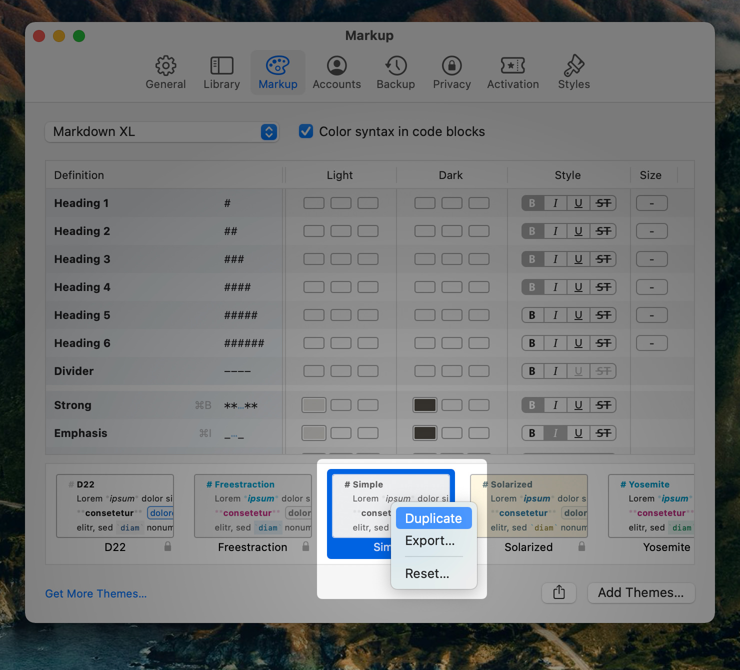
Right-click again and choose “Edit….”. You can now name your theme and add an author. Below these input fields, you see the color palettes for both the light and the dark version of your theme. The first two swatches define the color of your editor background and the body text. The other color swatches are at your disposal for fine tuning your markup.
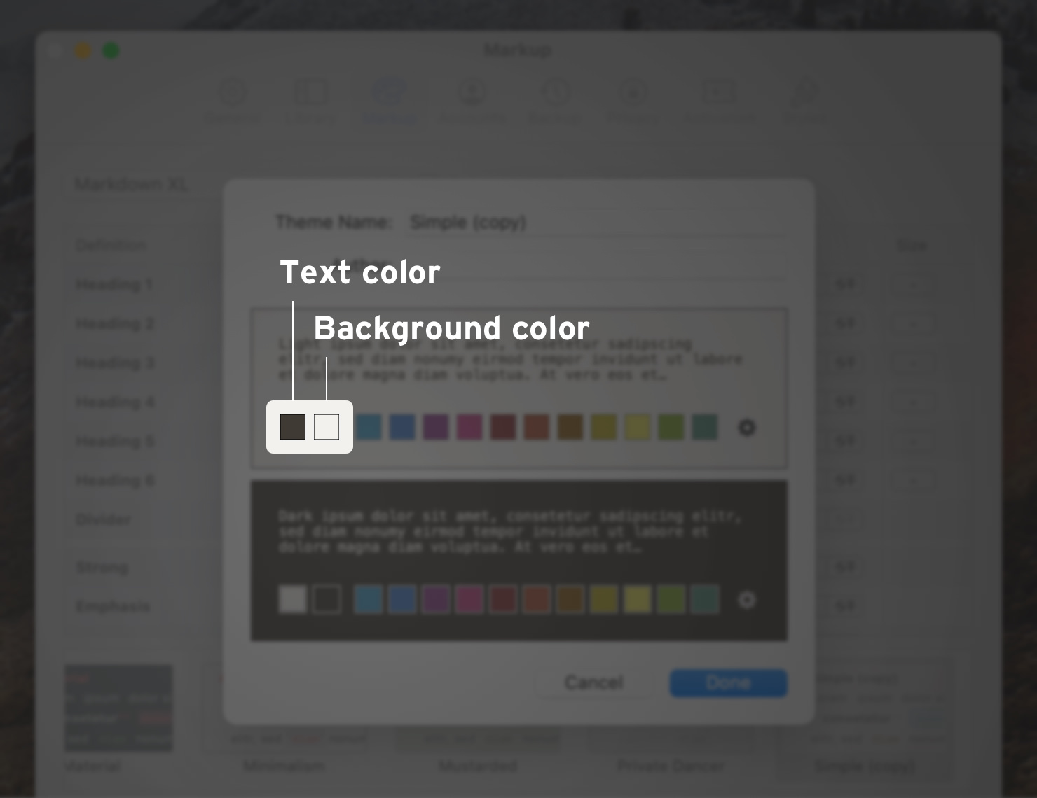
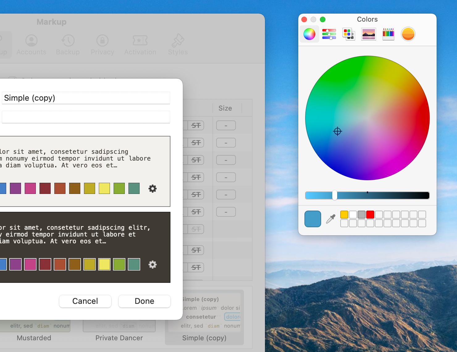
Clicking on a color swatch will open the color picker. You are free to choose whatever color you like. Changes of background and body text will instantly affect the preview of your theme. Additionally, select up to eleven accent colors you can later use for headings, emphasis, list, links and all the other available markup tags.
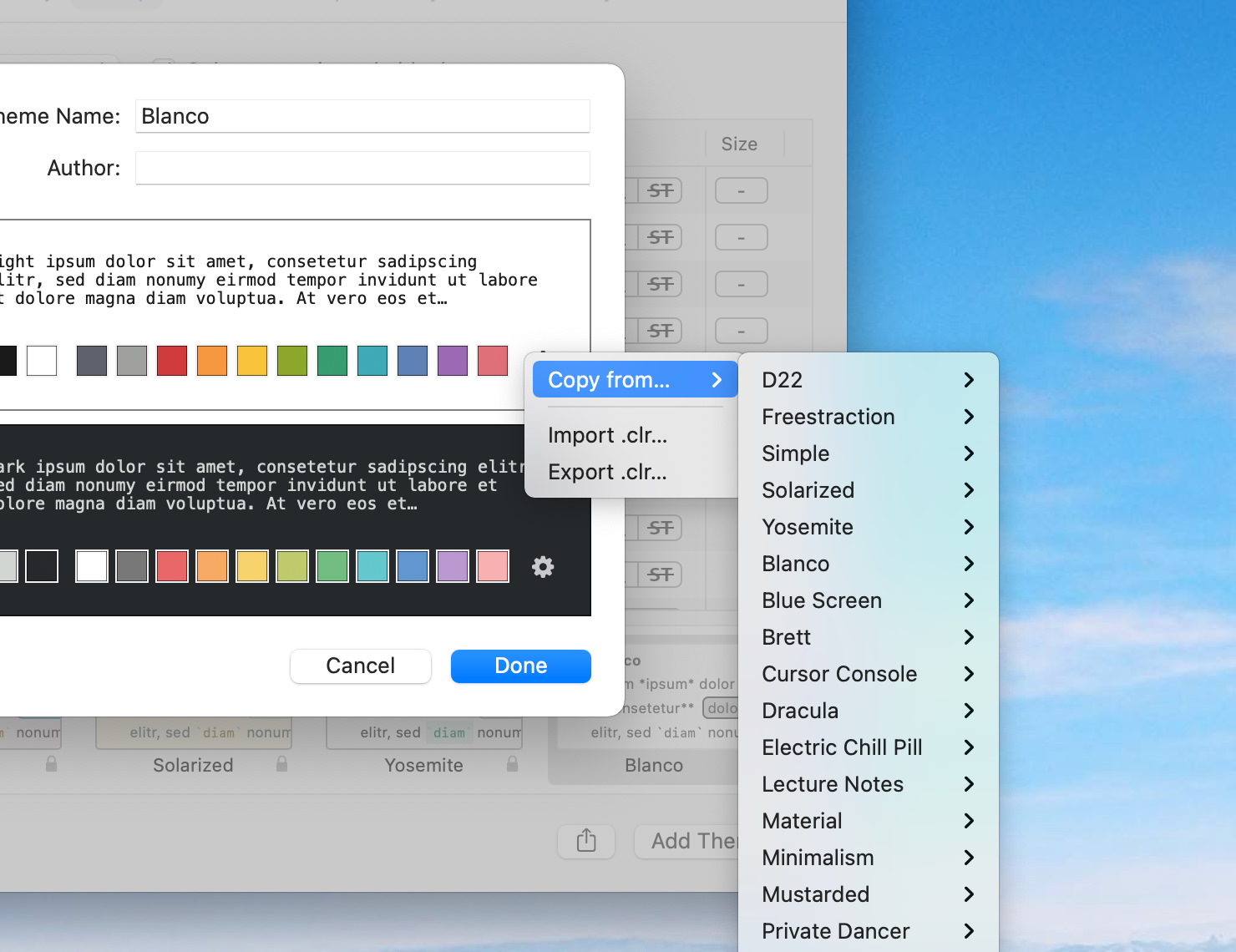
You can also copy entire palettes from other installed themes, or even import a home-made palette. For this, click on the little gear icon in your theme’s preview.
Side note: There are several dedicated plugins and tools you can rely on to build your own color scheme. As an example, try Coolors – their web app is free.
When you’re confident with the color palette, click Done. Now you’ll see a table allowing you to shape the appearance of your markup into great detail. For both the light and the dark version of your theme, you can now define the color of the tags, the tagged text and, where required, a line highlight. Click on the respective box to open a color selection panel. Furthermore, you can determine the text style in the right-most column: bold, italic, underlined or strikethrough.
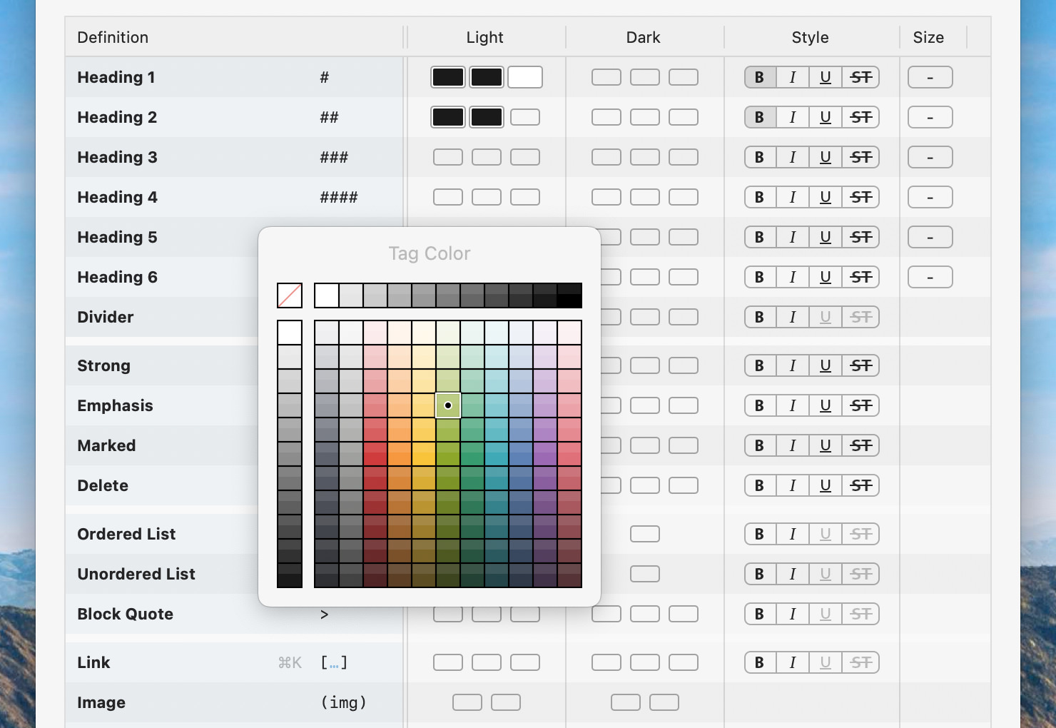
You can make use of your palette’s colors in their pure version or in lighter and darker nuances. For example, you could display dark-green text on a pastel green background for a link.
Combination possibilities are endless. You could even make markup characters virtually invisible by changing the tag color to your theme’s background color (not that we would recommend this).
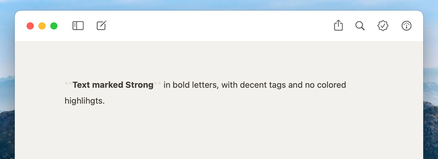
As an example, let’s assume you want to see text marked Strong in bold letters, with decent tags, and without color accentuation. Go to the row Strong and click on tag color. In the color selection panel, choose a lighter nuance of your body text color. Use no color at all for text and highlight, by choosing the crossed out white box in the upper left corner. Then, make sure to select Bold in the Style column.

Depending on the colors you chose for body text and background, text that was marked as strong will now in your editor look similar to this:
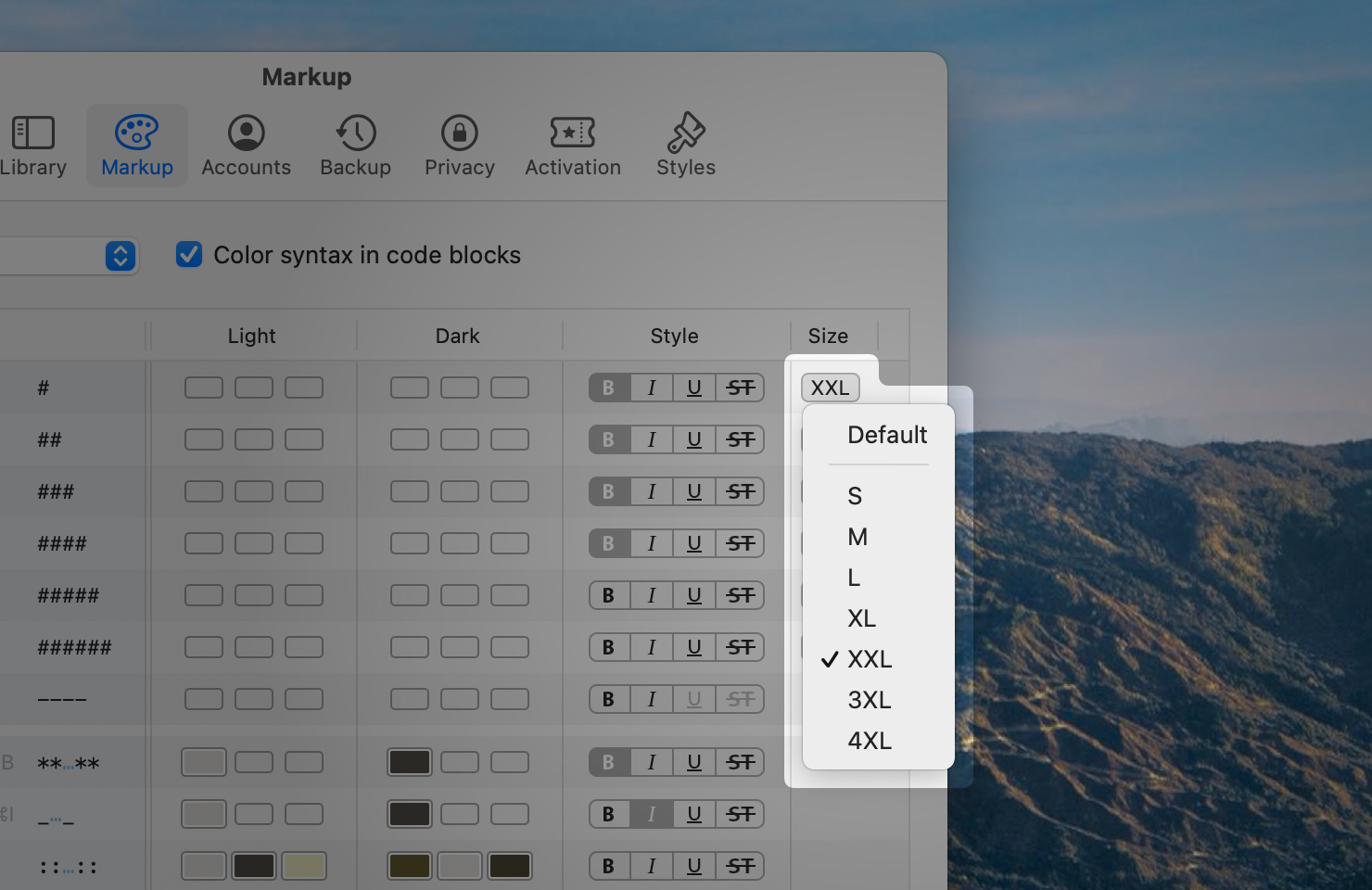
For headings, you can additionally adjust the size. This makes it easier to distinguish headings from the rest of the text, and between headings of different levels. You can choose between the default size and seven other sizes – from S to 4XL.
Share Your Theme
You’ll probably find that it takes a little to play around and select the right colors for a harmonious result. If you’re happy with the look of your theme, consider sharing it with the community, making others happy, too.
For this, select yours in the list of themes, click the Share button on the bottom and select “Share on Styles & Themes…”.
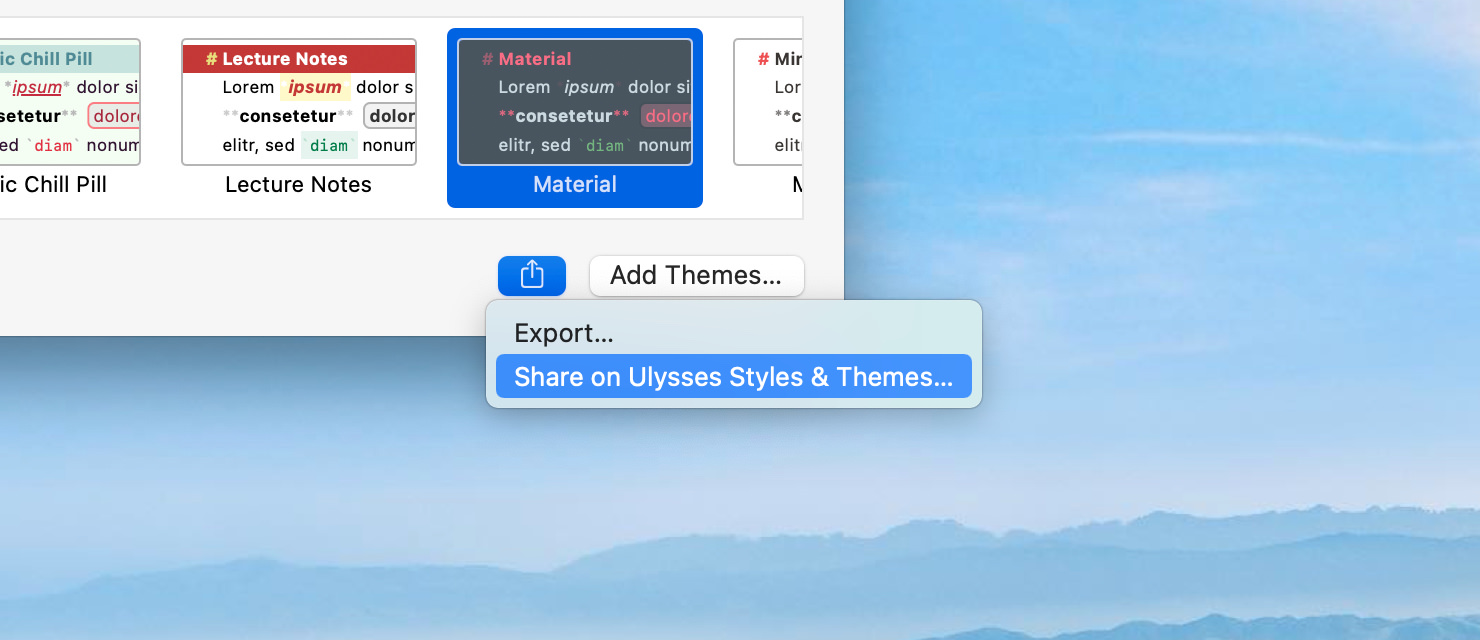
If you haven’t yet, you’ll be prompted to create a new account for the Styles & Themes website. If you already have one, you’ll be lead directly to an upload page for your theme. Here you can add a description as well as keywords, and choose to display a light or a dark preview of your theme.
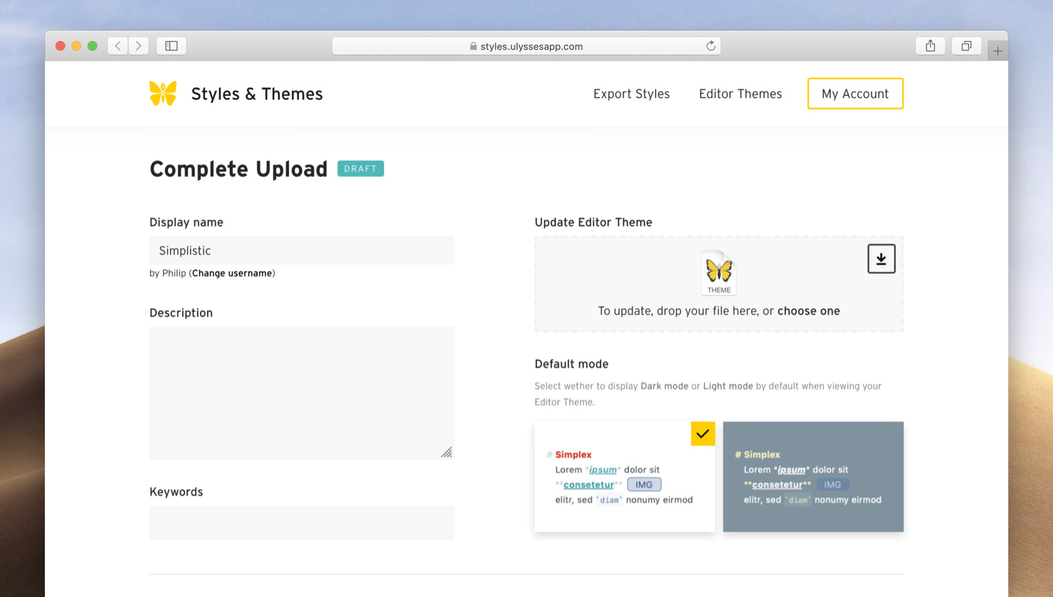
Click Save to submit. As we review every contribution, it may take a little time until your theme is visible on the Styles & Themes website.
This article was last updated on March 22, 2021.